Which Watch
Smartwatch Selector
UX
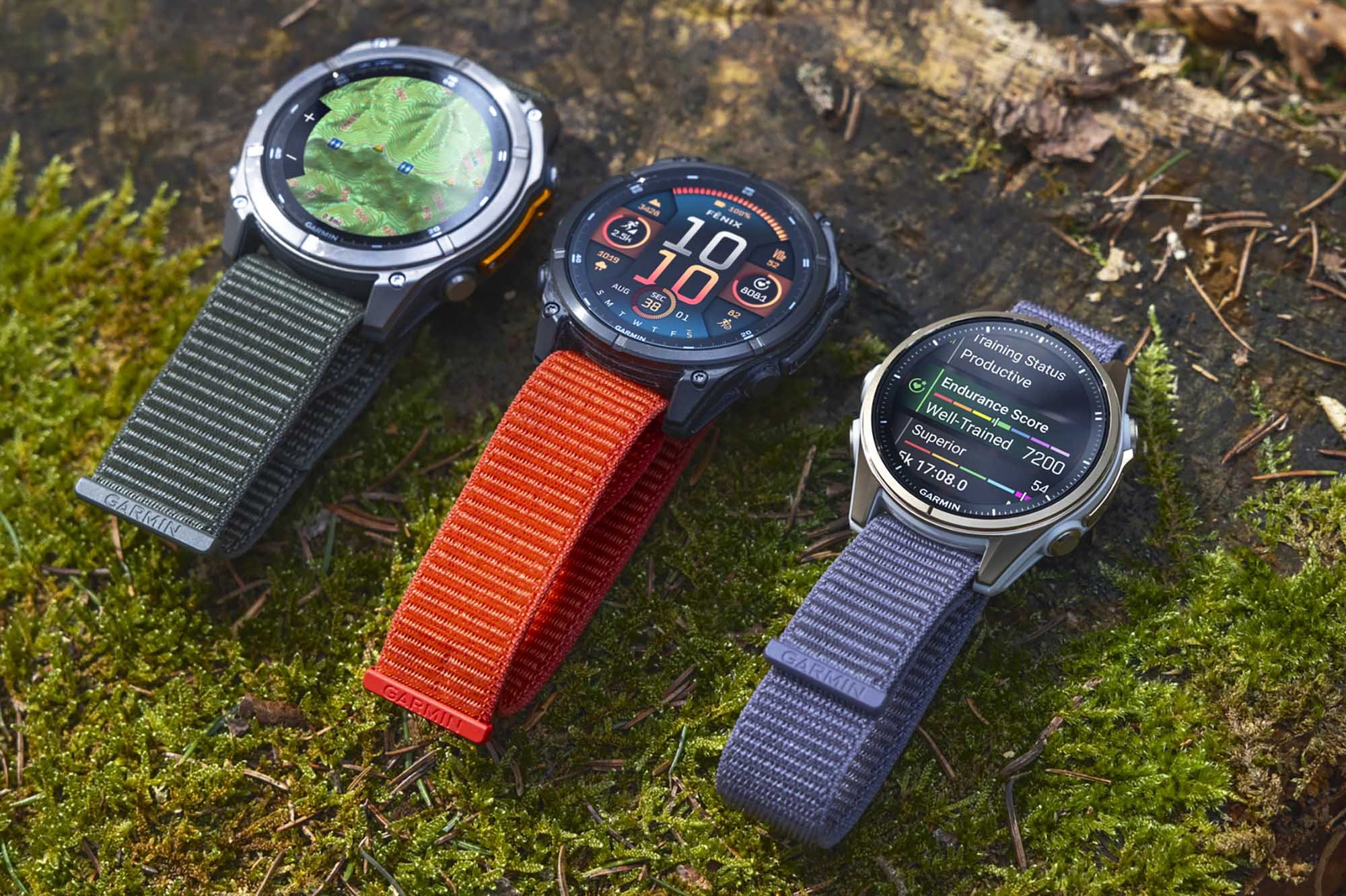
Garmin offers dozens of smartwatches with hundreds of features. With so many options to choose from, users often feel overwhelmed. And the company’s tool for helping navigate these watches wasn’t making it any easier. I set out to revamp how customers across the world found the right smartwatch for them.
The Problem

Garmin sells dozens of smartwatches.
And unlike its competitors, there’s not always an obvious difference between models. This leads to countless questions and consumer confusion — both online and off.
The Situation
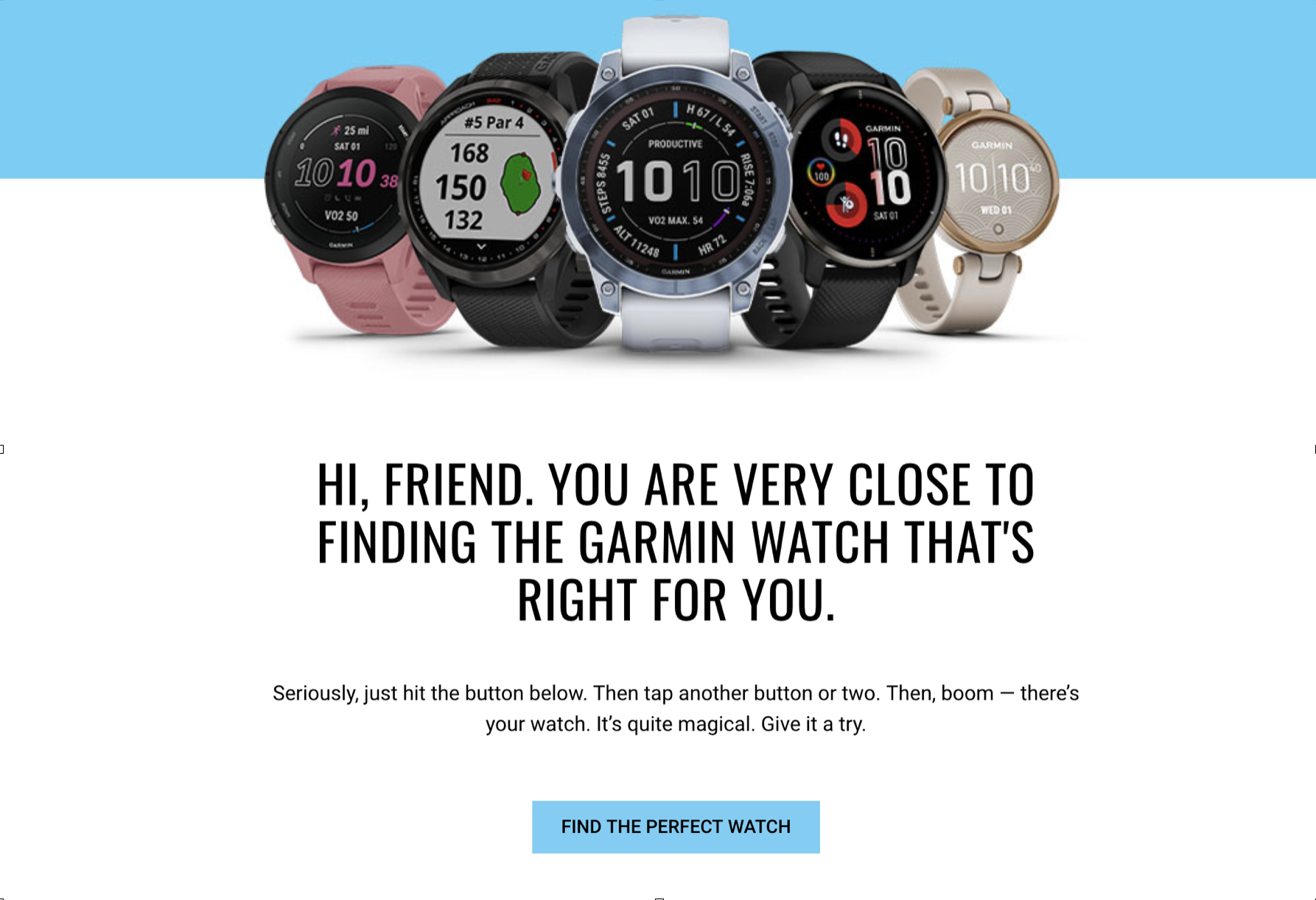
Garmin built a tool to help solve this problem.
But there’s a bigger problem.

The tool isn’t very helpful.
Consumers are pushed through a complex, inflexible decision tree. From the very start they’re asked to label themselves as just one thing.
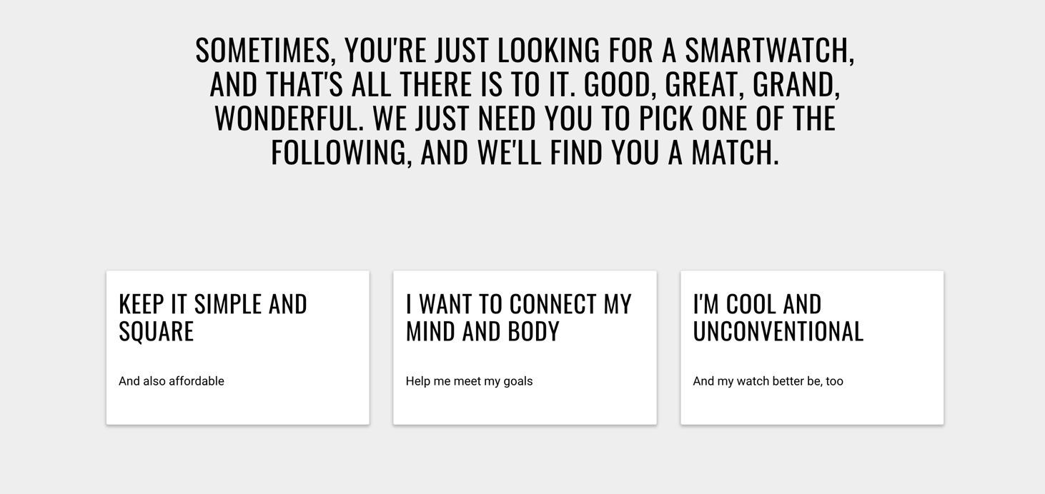
🖋️ The copy is long, poorly formatted and visually unappealing.
🛑 Consumers are forced to make confusing decisions. Often clicking through 4-5 choices before reaching a product.
📈 Every time a new smartwatch is released, the entire decision tree has to be recreated.
The Solution
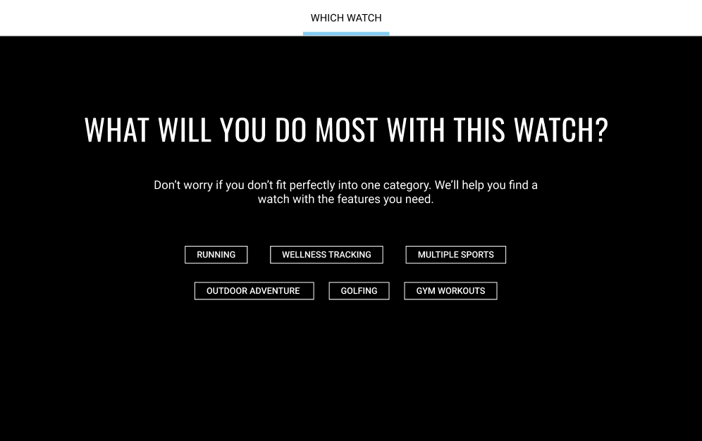
For starters, we need to change the homepage.
Garmin owners tend to do multiple activities. This subtle tweak in copy asks the user what they do most and reassures them they’ll find the right watch.
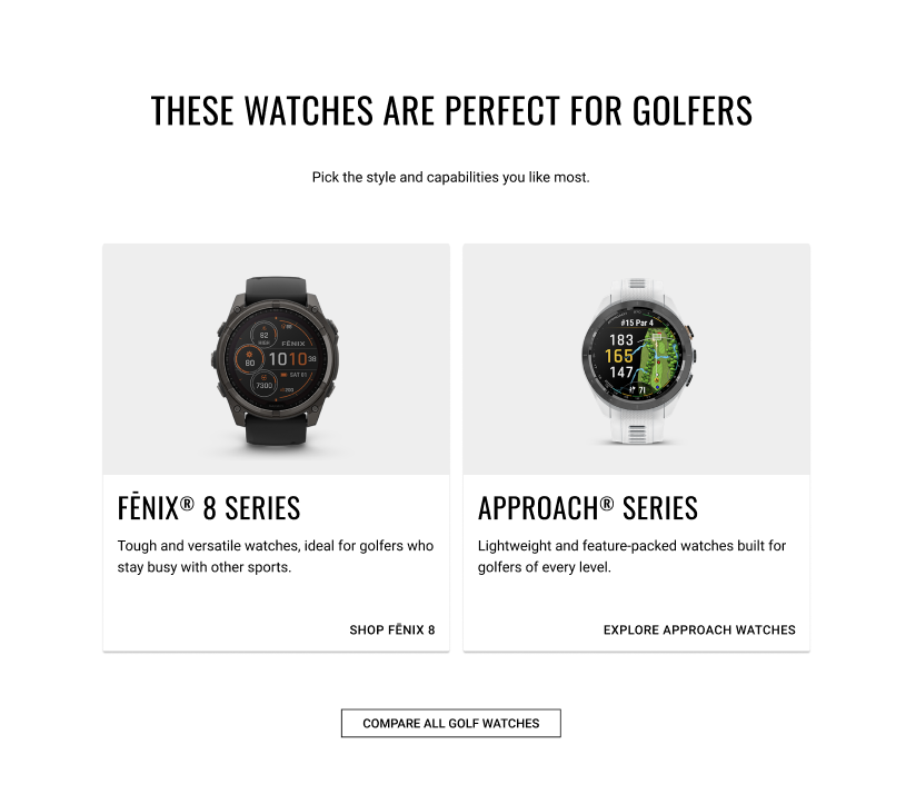
Next, we need to simplify the decision tree. For example, if the user selects “golfing,” on the previous screen they’ll choose between two different lines of smartwatches.

🖋️ Shorter copy gets directly to the point and highlights the features that would sway a user’s decision.
📷 Because differences are often highly cosmetic, watches are visualized.
🟢 Consumers only need to make 2-3 decisions before landing on a watch.
📉 From the backend, it requires far less time to swap out watches after a new release.
